Iteration 3 - Concept Development
Iteration 3 took place from 25 September 2020 until 23 October 2020.
Inspiration from other build systems
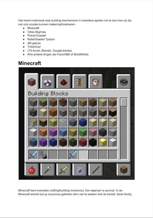
The first step into further developing this build system was by analyzing the building mechanics of other popular sandbox games and building tools. We would look at how certain things are being build and how accessible these features are. We have taken a look at four different building mechanisms: Minecraft, Cities Skylines, Rollercoaster Tycoon 2 and TinkerCAD.
All systems had different mechanics. Citities Skylines demands you to place roads. Around these roads then appears a grid. You can decide what type of buildings you want to be placed. The game decided how these houses will look like. You can also terraform the landscape by applying one of the four provided options. RollerCoaster Tycoon has many mechanics. You can create a rollercoaster or path by using the interface on the left. You click on track parts for the rollercoaster and directions for the path. Subsequently, you can decide whether to place this part. You will have to select and afterwards perform an action in order to manipulate placed paths/parts. In Minecraft Creative Mode you can fly around the world and you have unlimited access to all recources. By using the two mouse buttons you can either place or delete a block, depending on which block in the world you are facing towards. TinkerCAD allows you to use many primitive shapes, which can be scaled and skewed. Rotation is done via Gizmo’s. The mechanics of RollerCoaster Tycoon TinkerCAD regarding respectively the selection method and Gizmo’s have been explored later on.
Ideas for building mechanism (research into different games)
First Unity ARFoundation + XR Interaction Toolkit test
First test using Unity + ARFoundation + XR Interaction Toolkit
Don’t be fooled by the extent to which this already has a bunch of interactions implemented. These are provided by the XR Interaction Toolkit. We quickly noticed however, that this didn’t work nicely and we would have to implement the interactions by ourselves.
Build system explorations
Having taken inspiration from different building systems on desktop computers, it was time to translate this into an augmented reality-native experience.
The biggest challenge with this was combining expressiveness — the extent to which users could create out of the box ideas and not be constrained by a set of assets — with intuitiveness and learnability. Take Blender for example. This is a great tool that allows someone to create anything they want. However, it has a big learning curve and is not intuitive at first.
Augmented Reality already solves a problem with 3d design software: viewport navigation. The user doesn’t have to scroll or use key combinations, they can just move around in the real world to see the design from different angles. This is something every user is proficient with, because it is equivalent to taking a video of something in the real world with a smartphone or tablet.
The next problem we needed to solve was the action of placing objects and moving them around. For this we took inspiration from Reality Composer by Apple and AR Makr by Studio Line Break. In Reality Composer, Apple chose to stick to gizmo’s for manipulation of the objects. These are three dimensional touch surfaces that are visible around the selected object that allow translation, rotation and scaling. One issue we found with this approach however, was that these touch areas were too small and therefore easily mixed up, especially on a smartphone. While testing Reality Composer with users we saw them scale the object when they intended to move it and vice versa. They also had to reach all the way to the middle of the screen to manipulate the object, which wasn’t ideal when holding a bigger device such as the iPad Pro 12.9 inch. Adding objects is done by clicking on the add button and selecting an object from the library. It then appears in the scene.
Apple Reality Composer interactions: adding, translating, rotating and scaling objects
AR Makr: adding and scaling objects
Another issue with Reality Composer is that it is slow to use. Everything is multiple clicks away and quickly composing a scene of multiple assets takes minutes. There is a good reason for this, which is improved learnability for people who have used 3d tools before, but for the average person this doesn’t necessarily help.
AR Makr can be seen in the above video. To add an object, you can select an object from the library on the left side of the screen. It then adds it to the circle projected onto the real world surface. Already placed objects can only be deleted however and adding multiple of the same object still requires you to click on the library icon every time.
Next to these two systems, we also explored other apps such as Adobe Aero and Torch AR but these didn’t introduce novel or improved interaction methods compared to Reality Composer and AR Makr. After this, we started concepting:
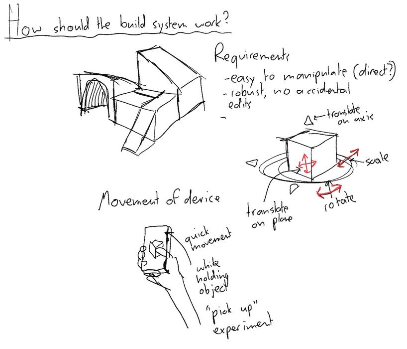
Build System exploratory drawing (27 September 2020)
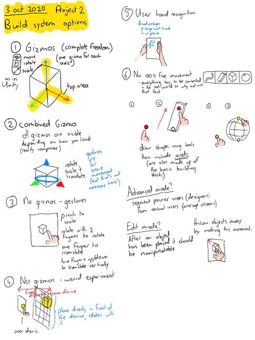
Build System exploratory drawing (3 October 2020)
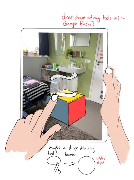
Build System exploratory drawing (4 October 2020)
Drawing in the real world
To get a feel for what it would be like to design things directly in the real world we went out with an iPad and started taking pictures. We created drawings and 3d models with the improvements we would like to see in that area:
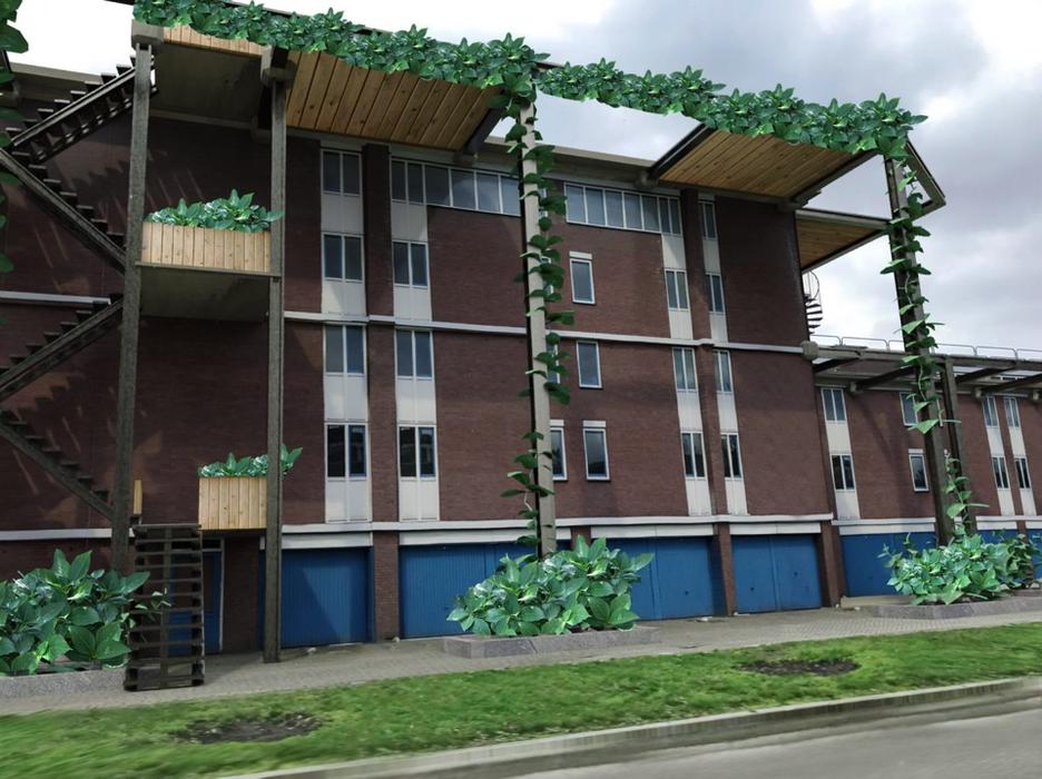
Build System exploratory drawing (27 September 2020)
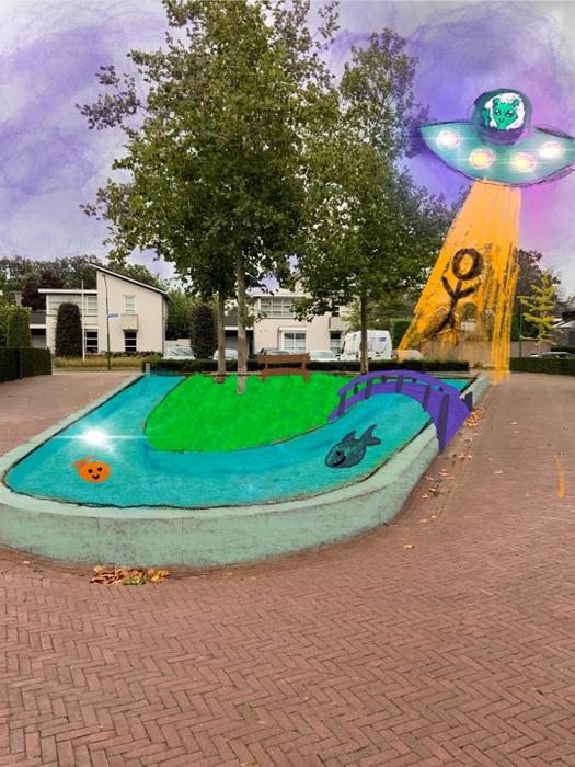
Build System exploratory drawing (3 October 2020)
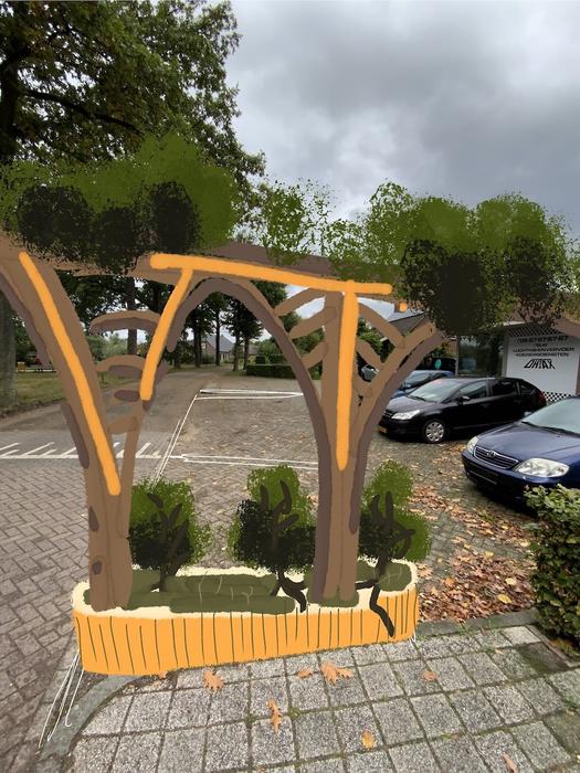
Real world drawing (4 October 2020)
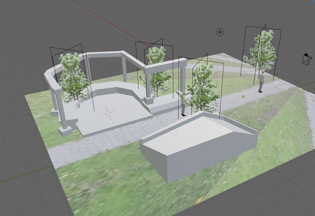
Build system further explorations (5 October 2020)
Patterns and objects
After this fun expedition into the real world, we saw that we would need both object placement, as well as the possibility to change the surface area. Patterns would have a material themselves, as well as have objects on them. That would allow for a shrubbery pattern that automatically places shrubs when it gets painted onto a real world surface. Or, grass with flowers, water with ducks on it. The list goes on. The concept can be seen in the following sketches:
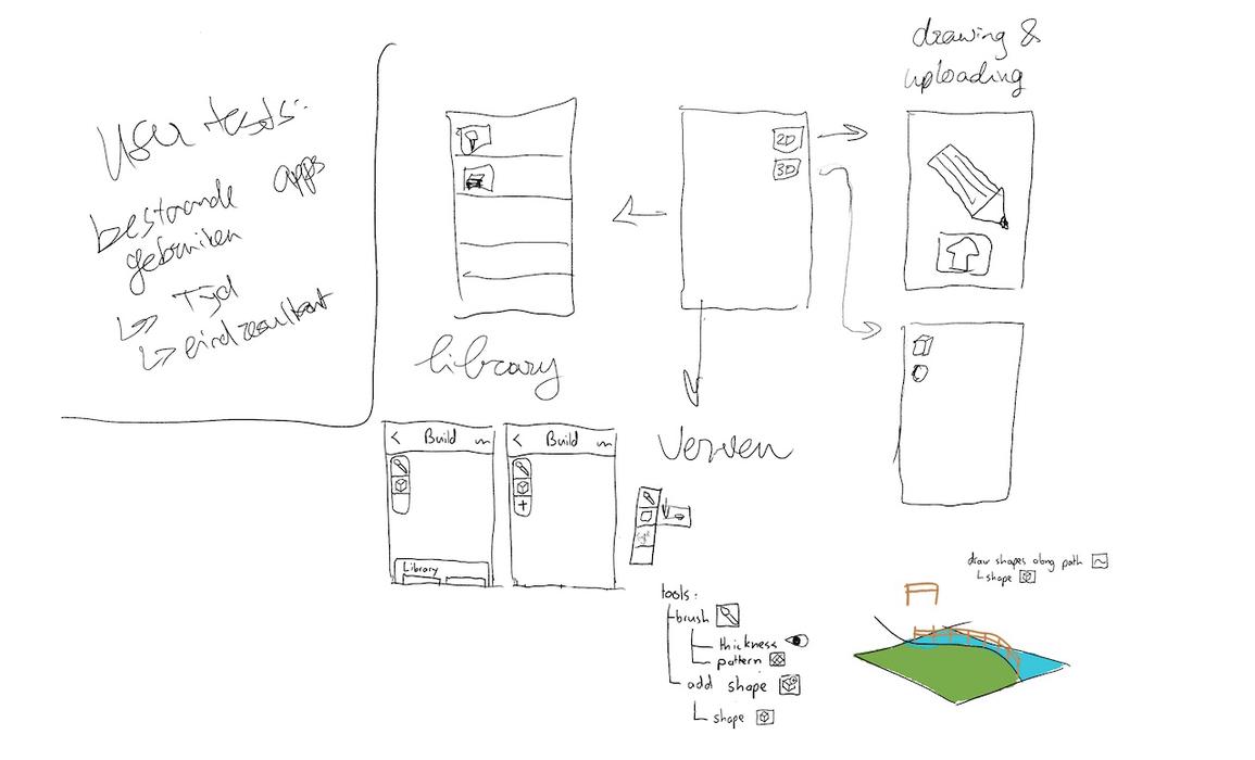
Build System exploratory drawing 2 (4 October 2020)
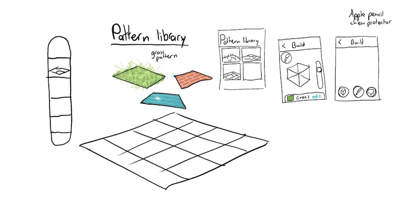
Pattern library exploration (4 October 2020)
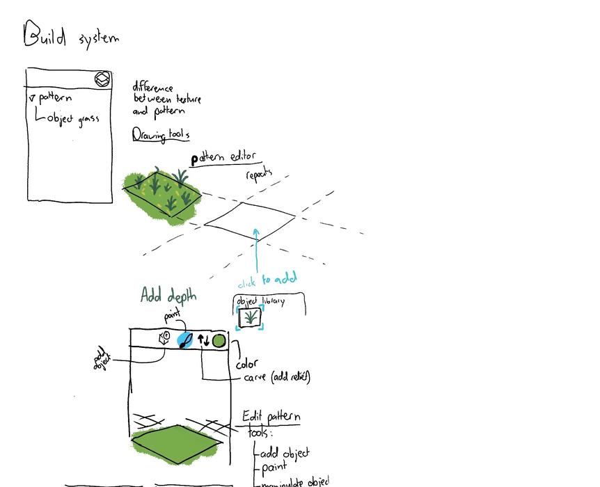
Build system further explorations (5 October 2020)
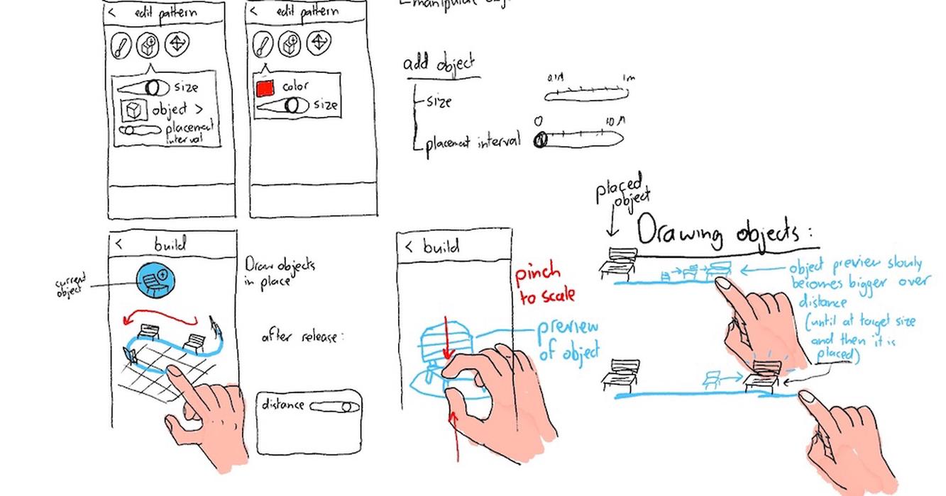
Build system further explorations (5 October 2020)
Ideation session on both the platform and build system
After having chosen the initial concept we had to focus on what aspects the platform would have: how we could motivate people to use the app and make it engaging for over a longer time period. We performed an ideation session (see whiteboards below) on 6 October 2020 in which we looked at similar games and wrote down what could make our game engaging, such as avatars, leveling up by gaining XP, achievements and titles. These could make the user more interested in the app for over a longer period of time.
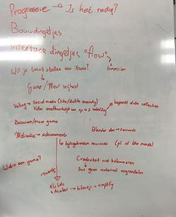
Gamification
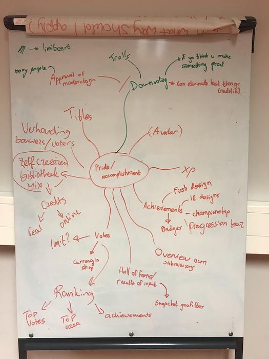
Reward and accomplishment
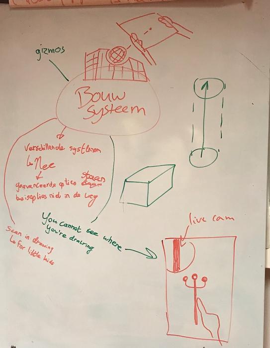
Build system functioning
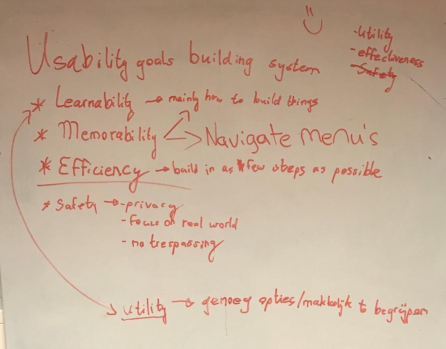
Usability goals build system
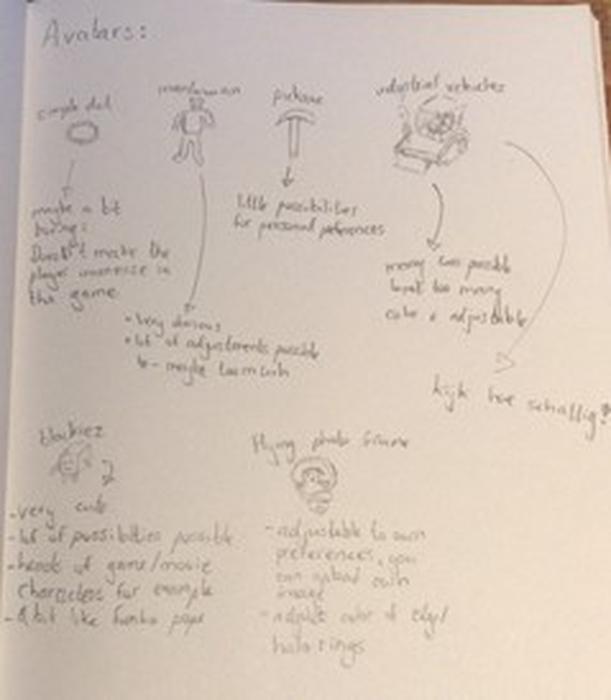
Ideation on types of avatars
Based on this ideation session, the next most important design decisions were made. One could progress in levels by gaining XP, which can be received by receiving likes and winning championships, receiving achievements or placing a build. By leveling up, players would collect more assets that can be used in the AR build system to be creatively make changes to your environment. As we found collectables to be an interesting feature for people to be encouraged to use the app, we decided to further dive into the possibilities of different types of avatars. The pickaxe was chosen at first, as we believed this best resembled the metaphor of building. If too many ideas are submitted in a close spot it can become quite unorganized. A function to cluster all ideas is more appropriate. A clearer overview of submissions was done by placing all submissions within a championship or clustering in a grid pattern. One could also use the search bar or the sort button in order to organize the submissions differently.
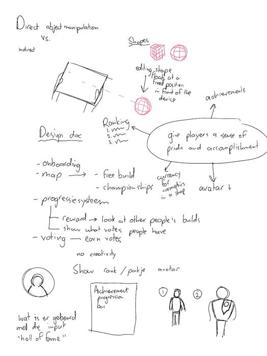
Manipulation and Avatars
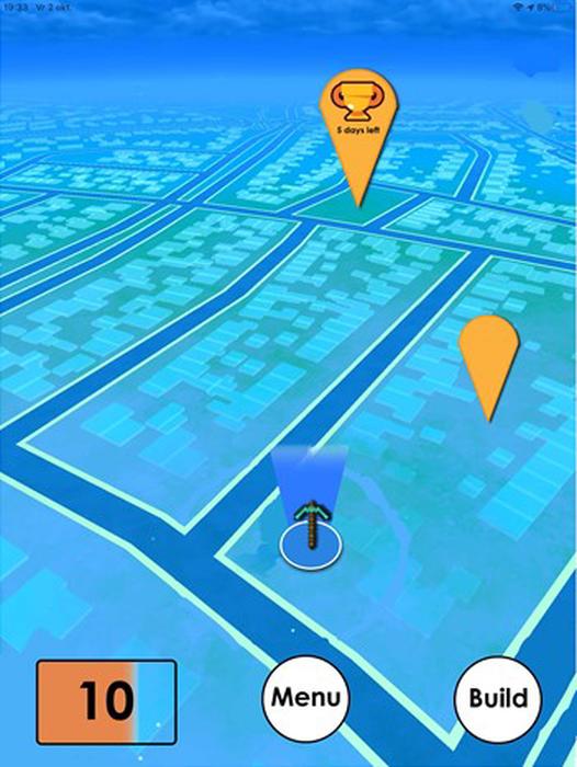
The main platform screen
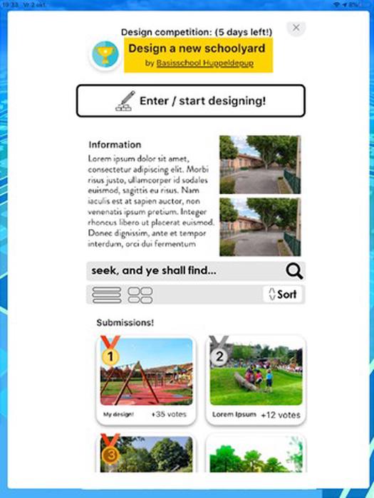
The championship page
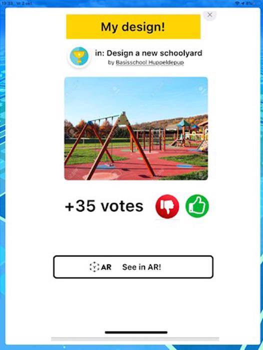
The page of a championship submission
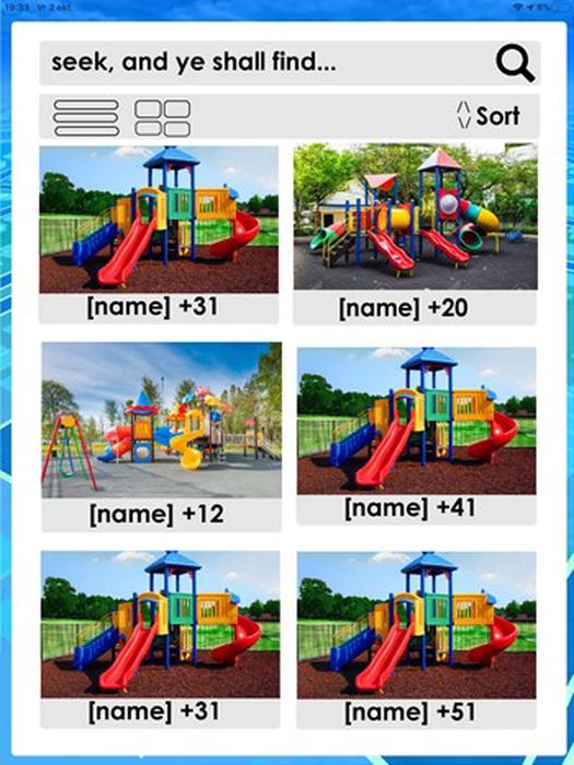
The grid of clustered ideas
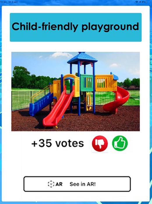
The page of an individual submission
However, not everyone will be interested in the more serious, communicative character of this app. Our gameful components as leveling up to collect assets seemed like a fun way of keeping people engaged to use the app for a longer time period were more appropriate for the achiever player type (Stewart, 2011), who are probably less interested in participating in urban design and planning. The goal for our target user is to express his/her creativity and interact with the ideas of others. Therefore, the game is mostly made for the player types explorers and socializers. As their temperaments can best be categorized as the idealist and rational (David Keirsey, 1984), the players will more likely benefit more from full access to all assets to express their creativity. For the same reason, the option of submitting a comment was added.
The current voting system was sensitive for people willing to troll their neighborhood and municipality. We got rid of the dislike button, as ideas could be disliked by groups on purpose. A personal profile needed to be made in which a user can find his/her achievements, as well as options to customize their interface. Solely screenshots of the AR build submission could cause confusion and a button to view the build in a real-world context was added. Furthermore, a description section was added so ideas could be sustained with some background knowledge.
Further Design and Ideation AR Build System
We continued exploring different directions we could go in with the build system, while staying true to our previously noted goals. We explored the direction of having everything made of foldable digital paper. This would be similar to how one could make 3d models in the real world using paper, thus improving intuitiveness. This would however, introduce a lot of complexity for the average person and was not the main focus of the app at this point.
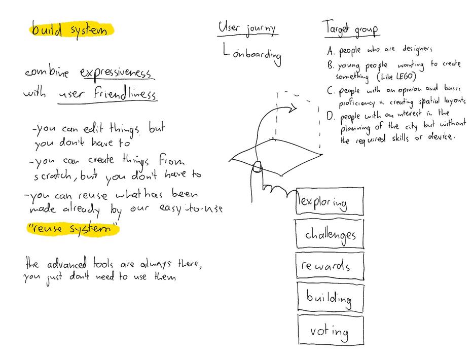
Build system and general concept definition (7 October 2020)
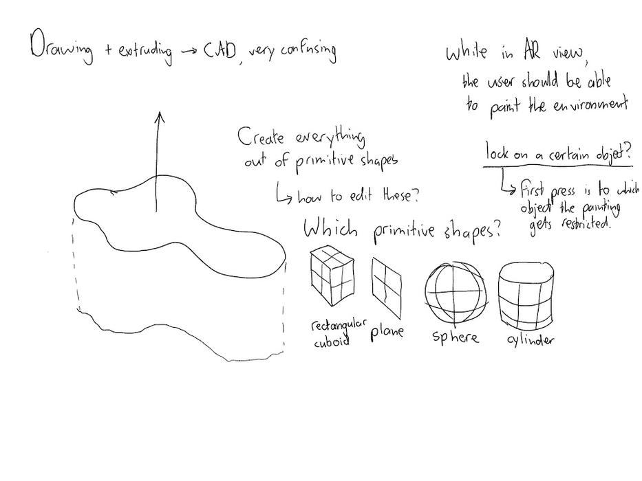
Build system explorations (7 October 2020)
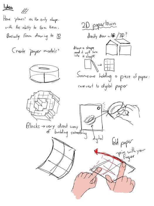
Paper models drawing explorations (7 October 2020)
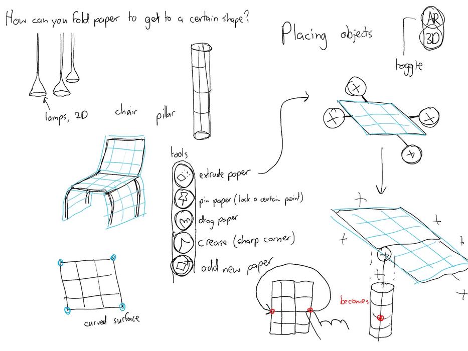
Paper tools drawing explorations (7 October 2020)
Expert interview with Gwen Klerks about citizen participation
To gain more knowledge in the field of citizen participation, we talked to Gwen Klerks about our project at 14 October 2020.
During the meeting there were some main learning points. We need to focus on what will happen after an idea had been chosen. We could look into possibilities for community building, so citizens themselves can build or realize a chosen idea. This could also apply to places that the citizens want to renovate or the moment an idea needs to be changed.
Furthermore, we could dive deeper into what will happen if an idea has been chosen. Showing the status of the actual realization would give users more trust in the value of spending time on creating designs with this app.
Furthermore, rewarding the builder of a realized idea could be done via a nameplate for example.
Game-like wise. We need to focus on rewards for players in-game such as votes or achievements, as well making sure the app stays fun even for over a longer period of time.
Subsequently, we contacted local municipalities to discuss the possibilities of actually realizing submitted builds if they are really popular or won a championship or the nameplate rewards. However, as we got no response, there was little we could do to find out more about these implementations.
Literary research on the process of urban planning
Further research was conducted surrounding urban planning and the inclusion of citizens during this process. What urban planning entails:
“Urban planning is a technical and political process that is focused on the development and design of land use and the built environment, including air, water, and the infrastructure passing into and out of urban areas, such as transportation, communications, and distribution networks.”
We found that urban planners must consider a wide array of issues, such as sustainability, existing and potential solution, tansport etc.. But actual opinions of citizens are not a requirement for urban planners, while citizens are the one’s who need to live in their neighbourhood every day.
The process of urban planning has multiple phases as can be seen in the image below. We believe we can make the most difference during preperatory/exploratory phase. This is where stakeholders are being involved in order for the government to make sure a common vision is being shared. In this project, we consider citizens as the most important stakeholder, together with their needs and wishes. The following phases are mainly up to the cities, governments and urban developers themselves. However, we believe the rich visual data created in our app can more accurately communicate the desires of citizens to urban planners, with as final goal to make sure these are implemented the way they were envisioned.
Many sources indicate the importance of citizens being included in the process, as these citizens have different visions and goals for the city, many other stakeholders won’t have thought of. Sadly, the actual participation of citizens in this process is often low (O. Smørdal, K. Ebbing Wensaas, S. Lopez-Aparicio, I Nilstad Pettersen, K. Hoelscher, 2016). This low participation has many causes, but are mainly due to the next three considerations stated in this paper to which many current applications cannot comply.
“How can the silos of planning and governance be managed?”
We believe our app can make it possible to include multiple stakeholders, as urban planning will be decentralised and accessible to everyone.
“How can the complexity of planning be embraced?”
We think the ability to create your own builds via an inutitive AR build system and share them on our platform allows the user to more easily share and communicate their visions and take away more of the process’ complexity.
“How can the quality of dialogues and collaborative learning be improved?”
Mobile phones serve as a bridge between the earlier adapted traditional concepts of community and citizen media.
Here they focus on the strong communicative aspect social media platforms process in order to reach out to citizens, which however do lack the appropriate tools. This shows the potential our app offers as a communitative platform. The AR build system provides the appropriate tools and the platform is the new urban social media platform to reach out to many new stakeholders.
Mockups AR Build System
To further work out the AR Build system it was important to transform it from sketches to actual application mockups. This allowed us to make more informed design decisions:
Animated interaction concept for creating planes (7 October 2020)
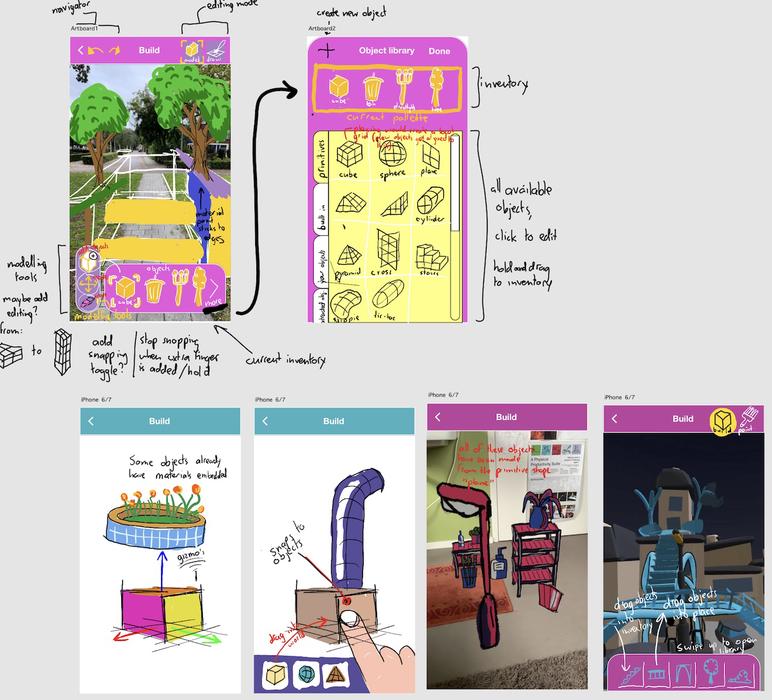
AR Build system concept (9 October 2020)
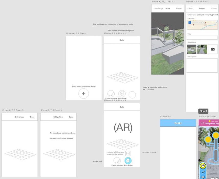
Adobe XD Mockup (9 October 2020)
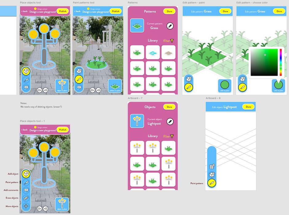
Adobe XD Mockup (9 October 2020)
Video of the mockup
Inventory prototype using Unity
Because having the inventory with assets was so central to the current design of the build system, we created a quick interface prototype in Unity to see how the mockups would translate into an eventual finished prototype.
Unity inventory prototype
Further design on AR Build System
After this, we continued defining the workings of the AR Build System via the following sketches and mockups:
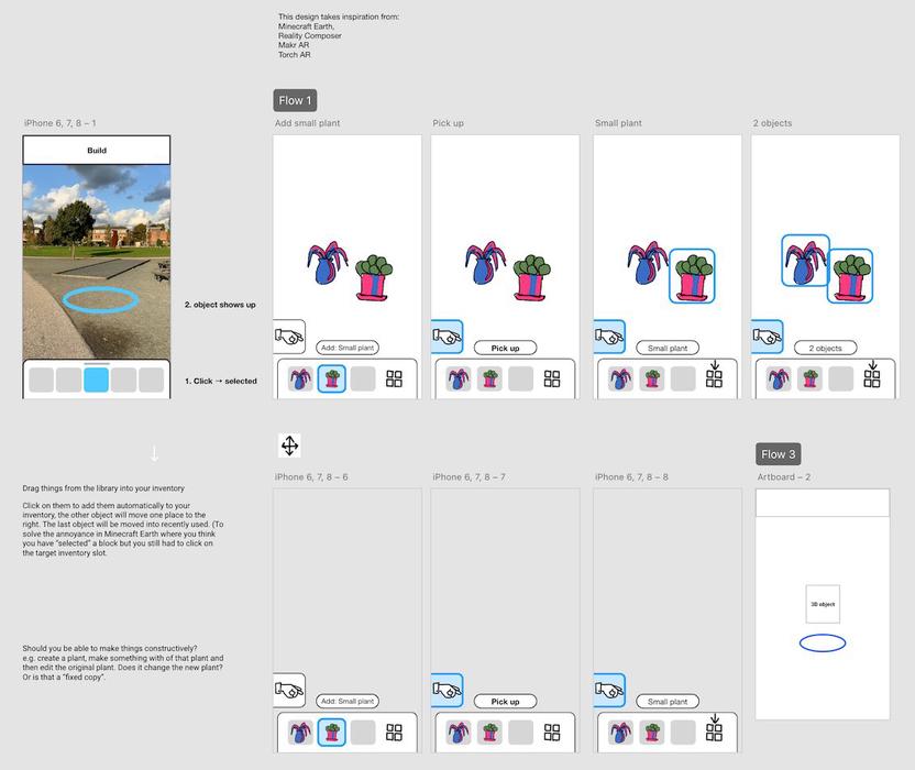
Adobe XD build system mockup (18 October 2020)
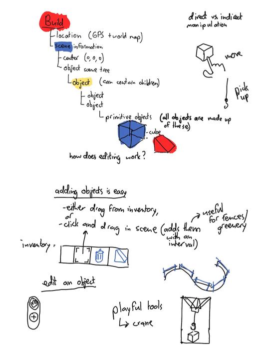
Build hierarchy (18 October 2020)
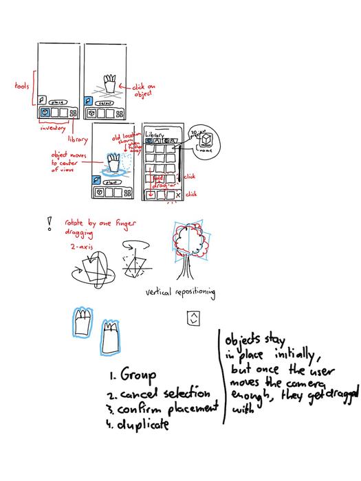
Build system (19 October 2020)
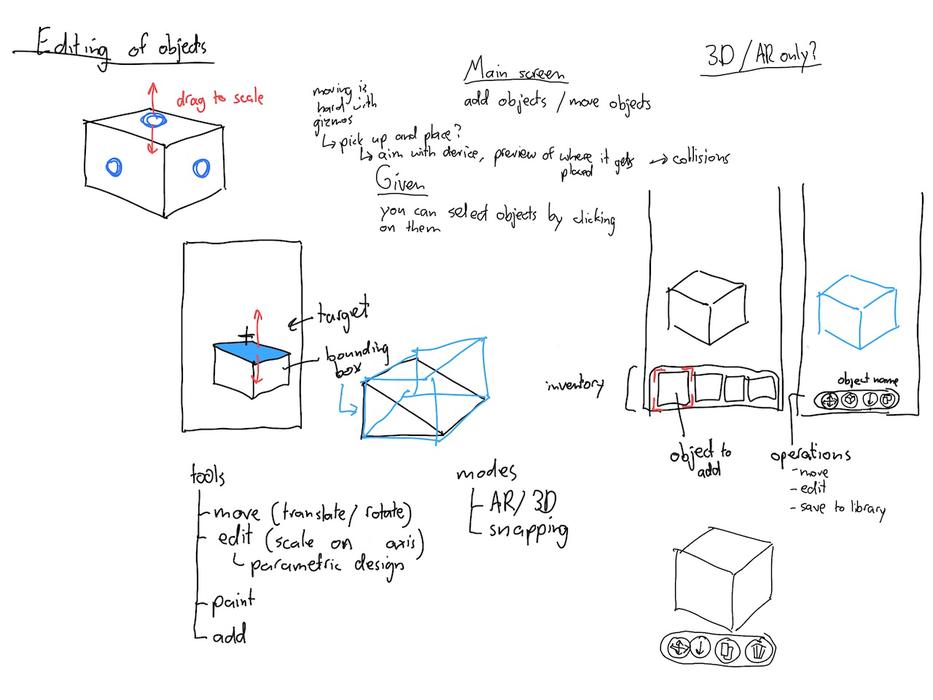
Editing of objects (19 October 2020)
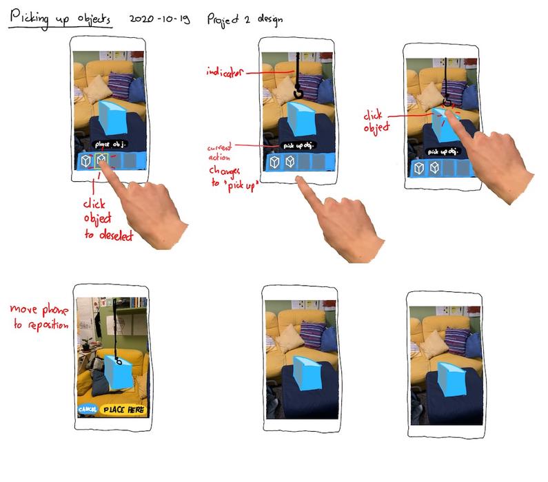
Picking up objects (19 October 2020)
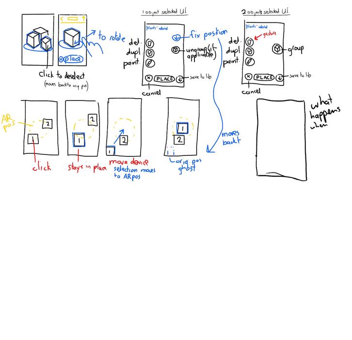
Selecting objects (20 October 2020)
Midterm concept
An ideation session about the name of our concept was conducted. Eventually the name TinkerTown was chosen and a logo was made, only to be discarded a day later. We thought it sounded too childish and did not convey the message of serving as a way of participating in urban design and planning. Up until a few days before the final day the product would stay nameless.
The build system is the main way of expressing one’s ideas about a specific part of the environment. The goal is to make this system both easy to use and expressive. It should allow artists, designers, and creative people to carry out their ideas, all the while remaining non-intimidating for beginning users.
For the build system, defining how the augmented reality part would work is of utmost importance, because of the novelty and wide range of possible implementations.
The way that people explore other people’s ideas - or rather, builds - will be through the use of a platform. This platform is centered around the idea of a map showing all contributions.
The second part of the platform is the method of communication between municipalities and urban designers and planners - and most importantly citizens.
As part of sharing ideas and submitting them to challenges, people should be able to voice their opinions. This way, a meaningful discussion can submerge with the aid of visuals and people get a clearer image of what they want. Voting also contributes to this goal. Users are can submit their ideas and express their creativity in three different ways:
An AR build
The AR building tool which is the main part of our app people can design their own neighborhood with the assets collected by playing the game. Once a user is satisfied with the build they made, the idea will be submitted to the app and visualized with a pointer.
A comment
If users did not feel like a build was appropriate in order to voice their opinion about a certain spot, they could also leave a specific comment.
A submission to a championship
Championships are pre-defined, time-bounded tournaments set up by the municipality. Users can submit ideas for this tournament by clicking the build button within this championship pointer. Once an idea has been submitted, it will can be viewed in a grid of all builds submitted to this specific championship.
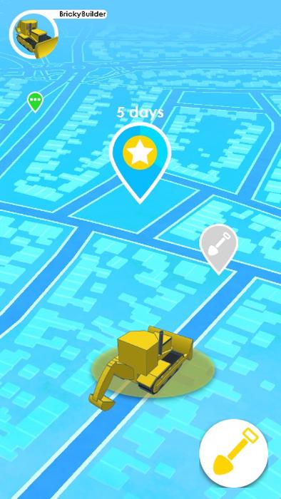
The main platform screen
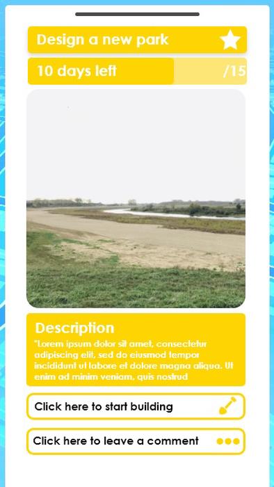
The championship page
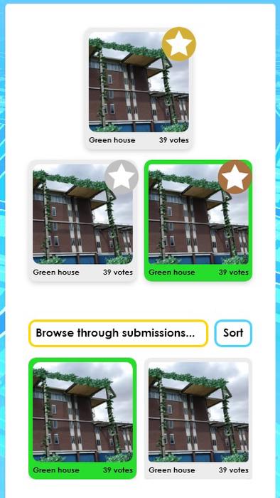
The page of the championship submissions
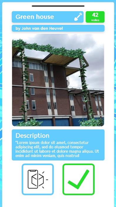
The page of an individual submission
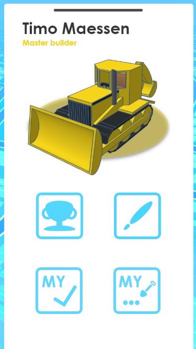
Your profile page
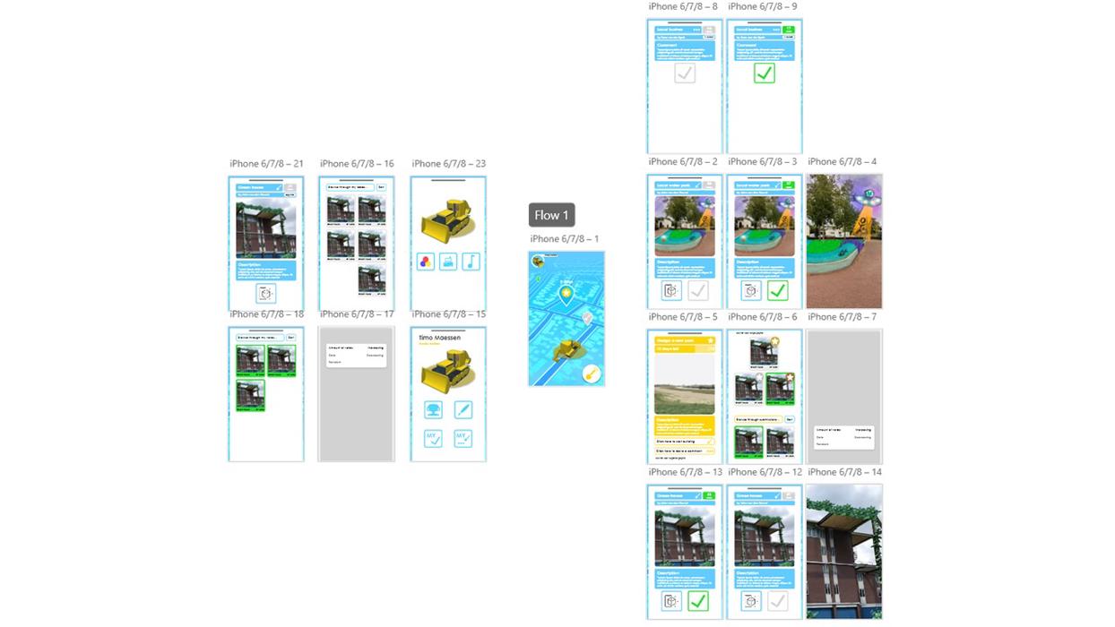
An overview of the whole platform
Midterm presentation
For the midterm we used two mediums to communicate our concept: a project description, a video and some images if desired:
“We aim to empower citizens to change the urban environment for the better, to increase their quality of living and connection to their environment.
We will do this through the use of a platform on which people can create, share, and discuss ideas. These ideas take on the form of contextual - location-based - augmented reality scenes, built up from an endless variety of objects.
Because you might not have the time to create a bench from scratch, the idea of remixing is introduced: you can choose to recycle objects, such as benches or greenery from the library.
You can also create new objects: Every object in our app is made up of primitive shapes, such as a plane, cylinder or sphere These shapes can be positioned in space and painted using the paint tool.
Ideas can be created as part of a challenge, created by a municipality or design firm, but you can also choose to create ideas at any location. To allow people to have meaningful discussions about the designs, the ability for upvoting and commenting is included. You can explore designs from all over the world by looking around on the world map.”
The goal of our video was to be engaging and get make people interested in the potential this project has to offer:
We would set the scene by showing shots of boring parts of Eindhoven and a person that was clearly not content with the current appearance of many parts in the city.
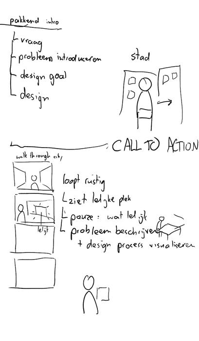
Initial brainstorming about video content
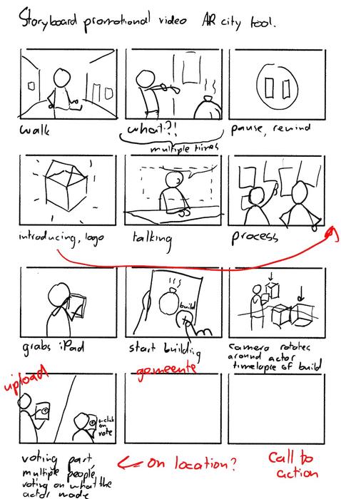
First version of the storyboard
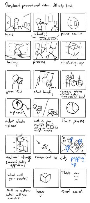
Second version of the storyboard
After this fun and engaging introduction, the problem statement and solution would be described. VFX visualizations were made in order to convey the concept of our AR build system. The images would further show the potential of this app. Later on, we would explain the core functionalities of this app.
A VFX shot of someone placing assets in the world via the AR building system
Another video of the same assets
Mockup prototype of the AR build system
Shot of someone using the AR build system
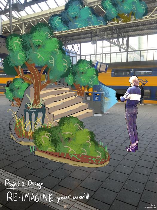
Potential of app visualisation 1
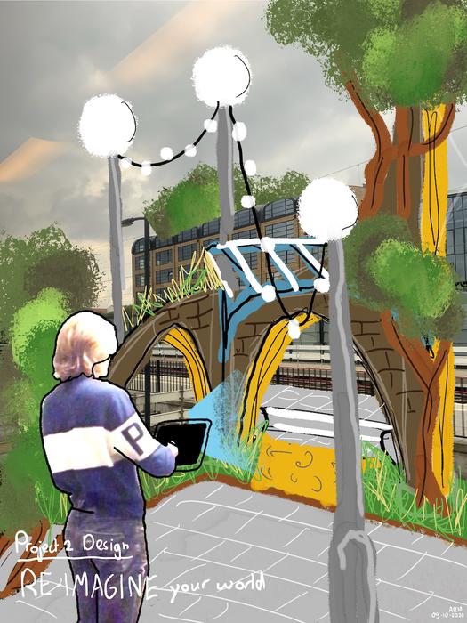
Potential of app visualisation 2
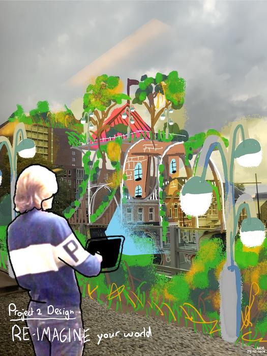
Potential of app visualisation 3
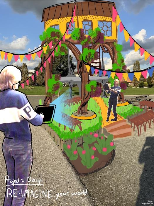
Potential of app visualisation 4
References
- Stewart, B.(2011). Personality and Play Style: A Unified Model. https://www.gamasutra.com/view/feature/6474
- O. Smørdal, K. Ebbing Wensaas, S. Lopez-Aparicio, I Nilstad Pettersen, K. Hoelscher, (2016). Key issues for enhancing citizen participation in co-constructing city futures. http://ceur-ws.org/Vol-1776/paper11.pdf

