Evaluation
Study set-up and execution
The user-test of the final AR building systemprototype was focused mainly on validating the usability of the building system and; the way people interact with the system and the rationale behind their actions. Afterwards a semi-structured interview would be conducted to better understand people’s actual experience with the app: whether they find it intuitive, whether they like the visual style and whether they would take time to apply this app in the real world.
Because it seemed like one of our group members had the corona virus, the user-test could not be performed in real life and needed to be done online. Based on the mockup prototype below, an actual digital user test would be created. Luckily, the test returned negative and the user-test could be performed in real life after all.
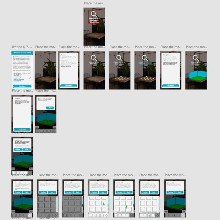
The first screens of the online user-test prototype
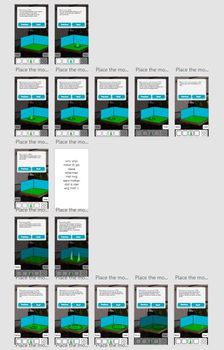
More screens of the online user-test prototype
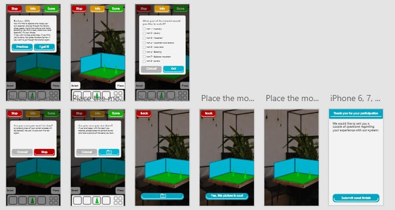
The last screens of the online user-test prototype
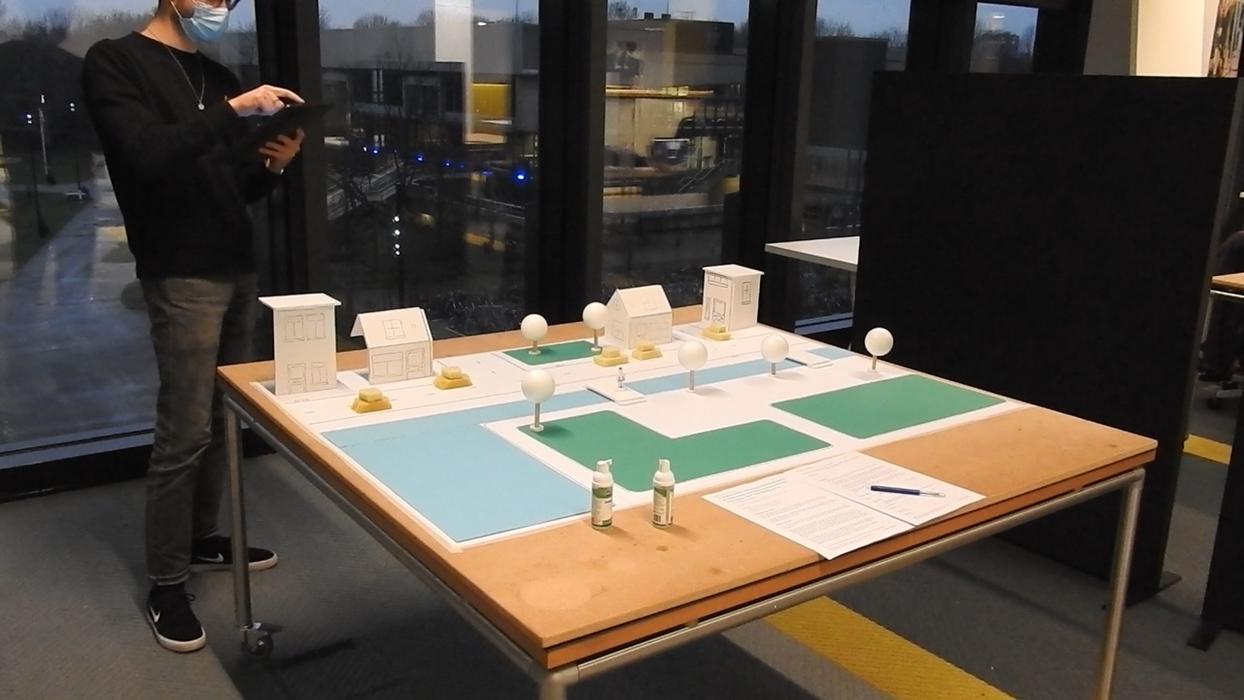
To make sure users can appropriately apply the functionalities offered by this app, an artificial town was build. This made sure people were able to adequately decide on the proportions and quantities of the chosen assets to be placed in the scene. Because of the lockdown we could no long access our facilities and a maximum of five formal user tests have been performed. Three on-campus and two in someone’s backyard.
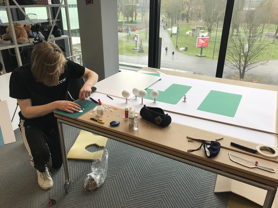
Building the scale model of the town
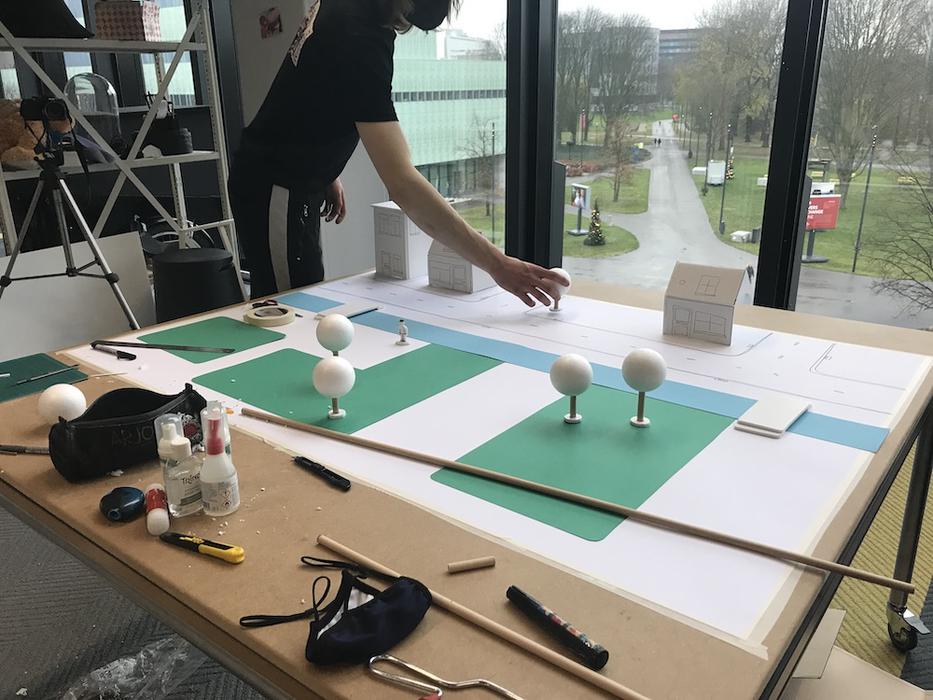
Placing objects in the scale model of the town
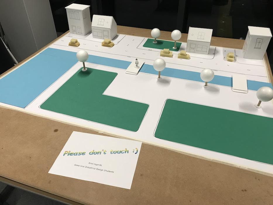
The final scale model with a paper in front kindly asking people to not touch it
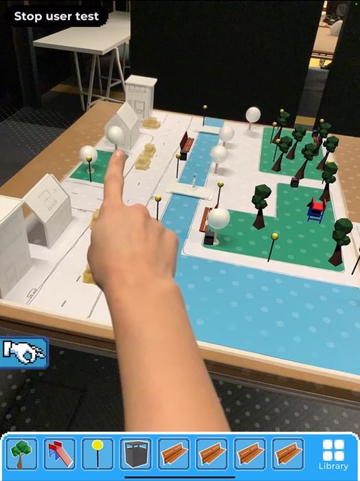
The third user pointing towards the house
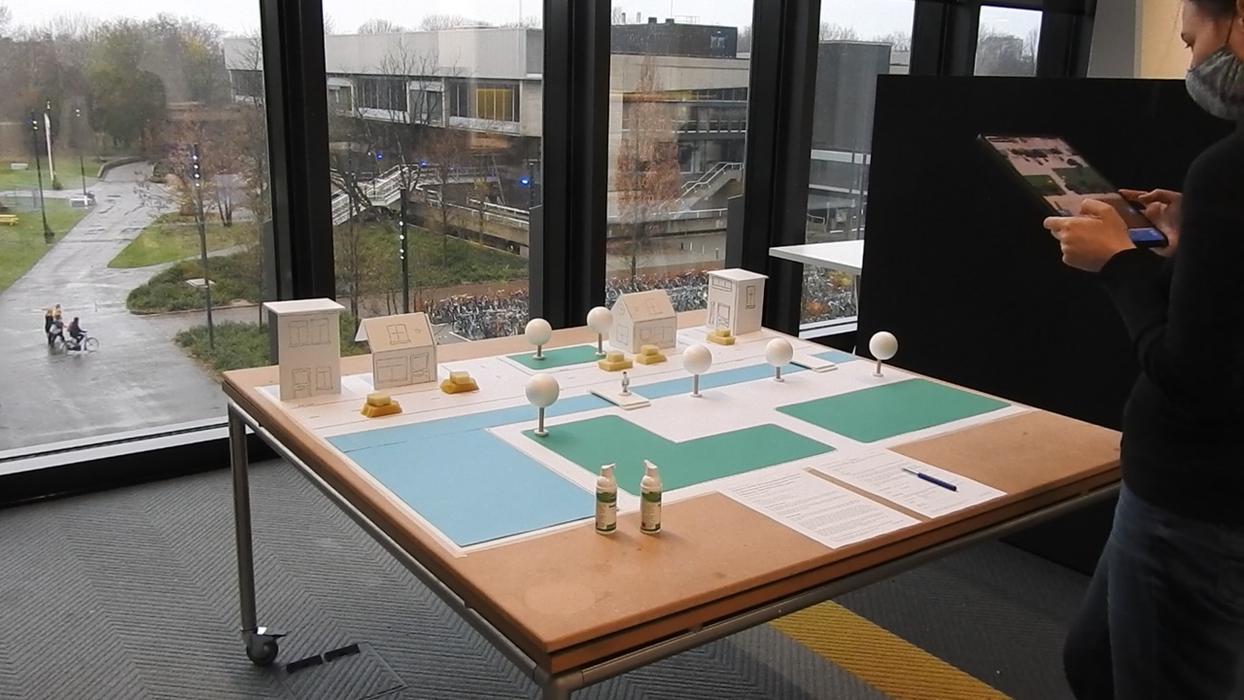
The first user test
The second user test
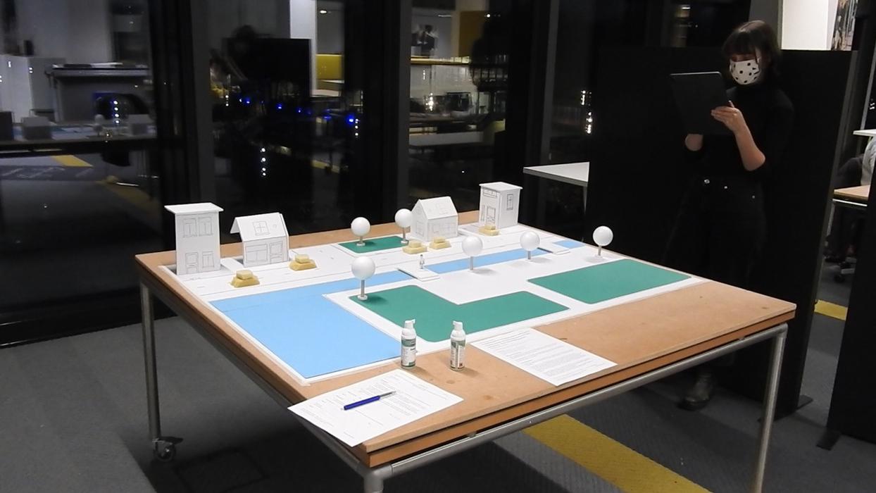
The third user test
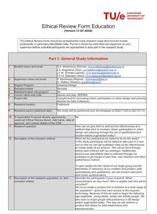
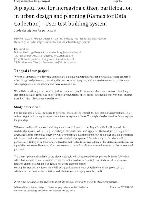
Ethics
An ERB Form, an informed consent form and a user testing protocol have been made.
Qualitative analysis of the results
In order to analyze people’s experience with the app while performing the test, the users were asked to perform the think-aloud technique. They would say what’s on their mind, why they want to perform certain actions and how it turned out. We performed the critical-incident analysis to analyze the qualitative data. It allowed us to scan through everything that has been said and note down the most important ones. Even though the results were very positive, there were some minor troubles the users experienced which we will quote below.
”It might also be cool if you could ‘align’ things.”
”It would also be nice that if you double clicked, the object would be placed.”
”Okay, I thought that if you would press this, you would go right back to the screen.”
”It should actually be even freer.”
All of these troubles were related to the efficiency of the system. Some additional ways of tapping or aligning could be great implementations in order to improve its overall usability.
After the session in which the user worked with the app, a semi-structured interview was conducted. This would allow us to get more insights into people’s experience with the app and ask further on their answers. Another critical incident-analysis would be performed for the same reason. See the following quotes:
”I thought it was super cool and was especially surprised that it worked so smoothly”
”It helps a lot with thinking … you don’t have to use your imagination, because it’s actually there.”
”I didn’t have to think about the placement, I found it super intuitive.”
”…an accessible tool for the public to give input with”.”
The responses were clearly very positive. People thought the system was very intuitive and fun to use. They did not have to think a lot about what buttons meant what. As envisioned, people could directly see their build in the environment, which really helped to visualize their ideas. A very funny moment happened when one of the users even took a look to the right of the iPad to see how her build looks like in real life, but of course, the build wasn’t there. This clearly shows how AR messes with your mind and makes it feel so realistic. Thereby, people saw it as an accessible tool which is appropriate to be applied in urban design and planning.
Of course, there also were some little things that users thought could be improved, which will be quoted below:
”The app is intuitive, maybe you should be able to determine which items are taken out of your inventory.”
”…so if the selection box would have been around the whole tree, maybe I would have seen the selection better.”
”I would prefer a fixed realistic size for some objects, and that you can always adjust it afterwards.”
Also here, the most reactions revolve around the app’s efficiency. People have to reselect objects from their inventory if too many items have been added to the inventory. Next to that, a true to world initial scale of the assets would mean the user needs to increase the size of an asset less. The selection box around the tree means the visualization of a selection could be made more visible. These are all relatively easy features to implement, and could be implemented in the app to improve its usability and accessibility.
Whereas we initially anticipated the user tests themselves to take around 5 minutes as described in the protocol, all of them lasted between 10 and 15 minutes. Users were given more time to build what they want. This was because of a constant that was evident from every single user test:
IT’S SO MUCH FUN!
Quantitative analysis of the results
For this user test a backend has been written, meaning every action performed by the user was logged. There were types types of data logs: the specific location defined in pixels where the user tapped the screen in order to perform an action such as clicking or rotating objects. The other type was location data defined in meters where the user manipulated certain assets on the scale model of the tabel. All data was eventually analyzed using python.
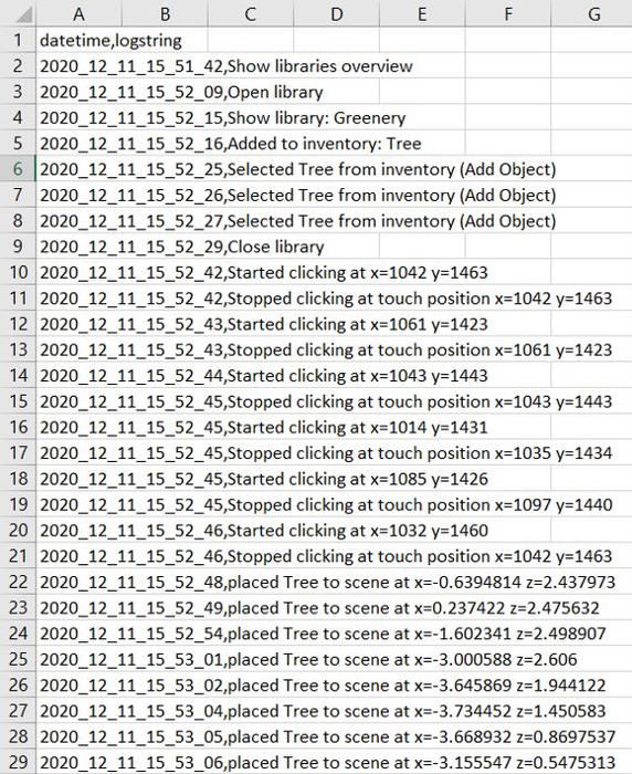
The initial logs consisted of two rows: the timestamp and a logstring. The logstring contained data about what action was performed and at what location. However, because of this format it became near impossible to analyze the different types of data as everything was defined as a full string. For that reason the database needed to be adjsuted in excel beforehand and all data was split using commas.
The log file before it was altered a bit manualy
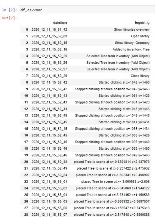
The python output of the not yet altered log file
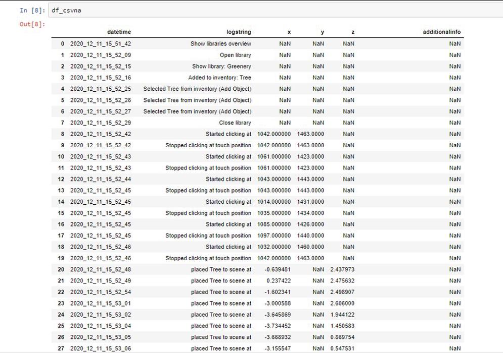
The python output of the altered log file
Most of the taps on the screen happened on the right side, as visible in both scatter plots below. To rotate an object people would have place there finger on the screen and swipe horizontally or vertically. Interestingly, these actions happened mostly at the middle right of the screen. Therefore, it could be smart to implement future buttons at the right of the screen to increase their efficiency. This could also depend on whether the users were right-handed. Implementing an option to flip the interface could be option to increase accessiblity for left-handed users.
The bottom scatter plot show where all users manipulated their assets in the scale-model of the city. As the origin of graphs vary based on where the iPad was calibrated (0,0), these values cannot be stacked. This is mainly evident from the third user. This person calibrated the iPad at the far right corner of the table, which led to a different calibration spot rotation wise.
However, they an be compared relative to eachother. Fun to see are the locations of the row of lamp posts in every single plot, showing why an alignment function was preferred.
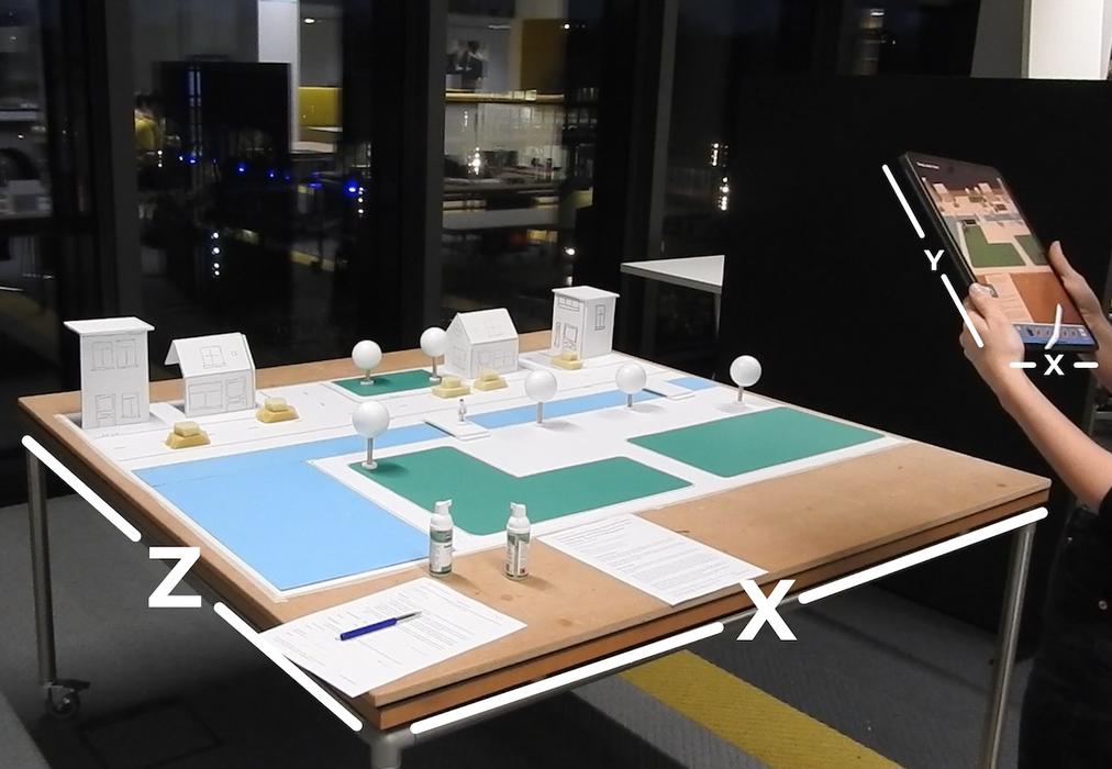
An indication of the x-, y- and z-axis on both the iPad and table
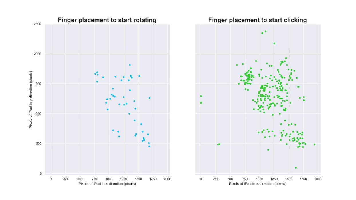
Where people tapped the screen of the iPad to click or rotate
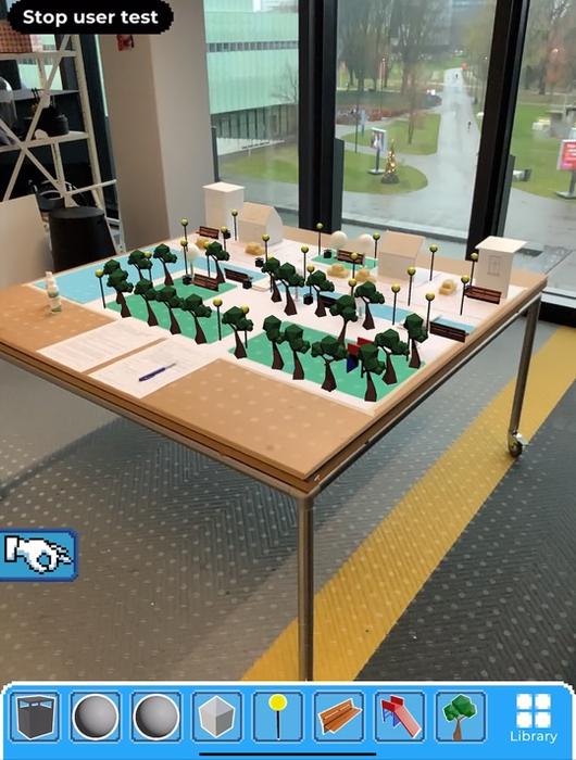
The final build of the first user
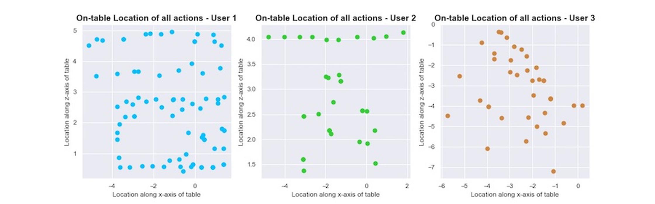
The locations of all placed objects on the table from the first three users
The street lantern was the most popular asset to be placed in the scene, whereas the bench was the item most often added to the inventory. It’s highly possible the bench is often chosen first because it is often immediately associated with the goal of ‘designing a park’ and therefore thrown out of the inventory once other items were added to the inventory. This means it had to be added to the inventory once again. This would explain why people wanted to be able to select which items go in and out of their inventory themselves, which was found out in the quantitative analysis. This assures us this still is a functionality we need to improve on regarding the usability of the system.
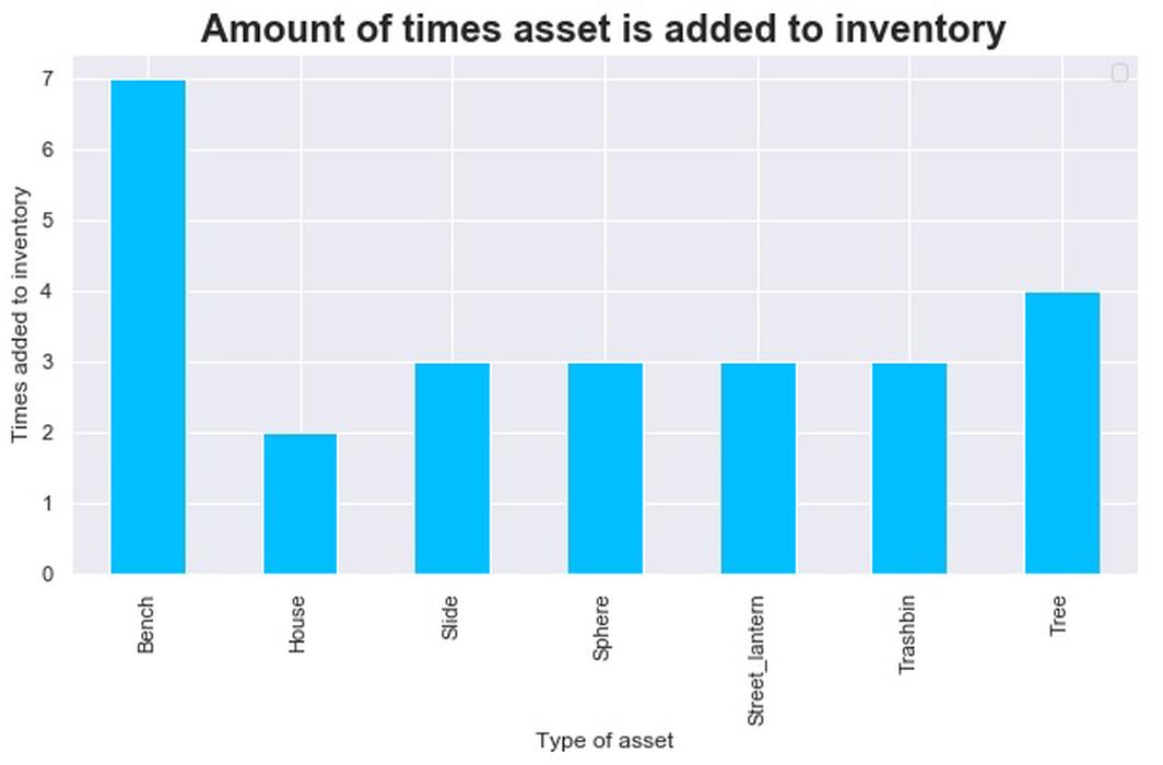
The amount of times an asset has been added to the inventory
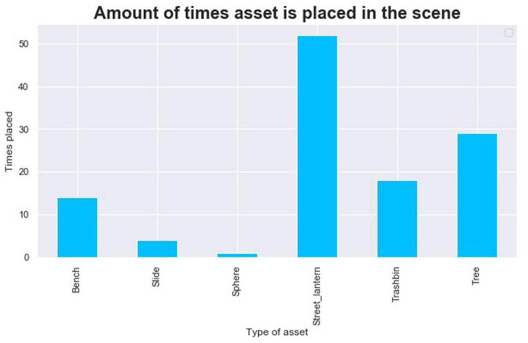
The amount of times an asset has been placed in the scene